001 · Healthcare Analytics

NY Medicaid
Primary Care
Ratios

A county level look at how many Medicaid members there are for each primary care provider across New York's 62 counties, built from public provider, enrollment, and shortage designation data.

Data Pipeline County Analysis Python SQL DuckDB Pandas Power BI NPPES HRSA

2026

Data Analyst

Solo Project

Healthcare

NPPES · NYS DOH · Census · HRSA

62
Counties Analyzed
6.36M
Medicaid Members, July 2026
47,073
Primary Care Providers
135
Members per Provider, Statewide
Process
Workflow
01
Data Ingestion
Downloaded the NPPES provider file, a Census ZIP to county file, NYS Department of Health county Medicaid enrollment, and HRSA shortage designations.
02
Cleaning
Kept active individual New York providers with primary care specialty codes, and assigned each ZIP code to a county. Every filter logs its row count.
03
County Join
Joined provider counts to county enrollment with Python and DuckDB, and calculated Medicaid members for each primary care provider.
04
Cross Check
Compared the highest ratio counties with HRSA shortage designations, and reported what the comparison could and could not confirm.
05
Reporting
Built a one page Power BI dashboard with a county map, ranked counties, and a New York City comparison.
Visualization
Provider Ratio
Dashboard
Power BI Dashboard July 2026 Enrollment September 2026 NPPES File
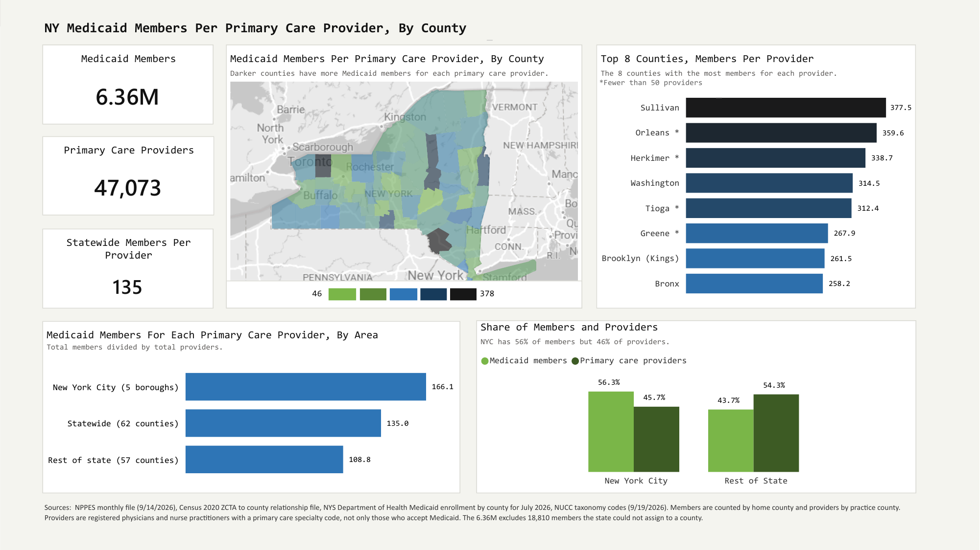
Power BI dashboard of Medicaid members for each primary care provider in New York. It shows a county map shaded by ratio, the top 8 counties, a comparison of New York City with the rest of the state, and each area's share of members and providers.
What I Found
Key Findings
Range
Ratios Run From
46 to 378
New York County has about 46 Medicaid members for each primary care provider. Sullivan County has about 378, roughly eight times as many. The statewide figure is 135.
135Members per provider, statewide
Where It Is Highest
Upstate Counties
and Outer Boroughs
13 counties have 222.5 or more members for each provider. Nine are upstate counties, including Sullivan, Orleans, Herkimer, Washington, and Tioga. The rest are Brooklyn, the Bronx, Queens, and Rockland.
13Counties at 222.5 or higher
New York City
More Members
for Each Provider
The five boroughs together have about 166 members for each provider, compared with about 109 in the rest of the state. NYC has 56% of Medicaid members but 46% of primary care providers.
166NYC members per provider, versus 109 elsewhere
Cross Check
HRSA Shortage
Designations

I compared the 13 highest ratio counties with HRSA's primary care shortage designations. 12 of the 13 have at least one, but so do 41 of the other 49 counties. Most designations in New York cover low income groups within part of a county, so nearly every county has one.

A random set of 13 counties would match this well about 39% of the time, and the ratio is only weakly related to HRSA's shortage scores (a rank correlation of 0.18). I treated HRSA as context, not proof. The designations are consistent with the ranking, but too widespread to confirm it.

12 of 13
Highest Ratio Counties With a Designation
41 of 49
Other Counties With a Designation
53 of 62
All Counties With a Designation
39%
Chance a Random Set Matches This Well
Method
How I Counted,
and the Limits
How I Counted
  • Providers: active individual New York providers in the September 2026 NPPES file whose first listed specialty is family medicine, general practice, internal medicine, pediatrics, or a family, adult, pediatric, or primary care nurse practitioner
  • Each ZIP code assigned to the county with the largest share of its land area
  • Members: NYS Department of Health county enrollment for July 2026
  • Members counted by home county, providers by practice county
What It Does Not Show
  • NPPES lists registered providers, not who accepts Medicaid
  • Headcount only, not full time equivalents or appointment availability
  • Only the first listed specialty is used, so some providers are missed
  • 243 providers (0.5%) had ZIP codes that could not be matched to a county
  • 18,810 members the state could not assign to a county are left out of county figures
  • Counties with fewer than 50 providers can change a lot on a small difference
  • NYC boroughs should not be read alone, because people cross borough lines for care
Stack
Tools & Data
Data Sources
  • NPPES: National Plan and Provider Enumeration System, CMS (file released 9/14/2026)
  • Census Bureau: 2020 ZCTA to county relationship file (downloaded 9/19/2026)
  • NYS Department of Health: Medicaid enrollment by county, July 2026
  • HRSA: primary care shortage designations (downloaded 9/19/2026)
  • NUCC: health care provider taxonomy codes (checked 9/19/2026)
Software Used
  • Python (pandas)
  • SQL and DuckDB
  • Power BI
  • VS Code
  • GitHub
Project Lifecycle
From Problem
to Delivery
01
Problem
Define the Question
Where do New York's Medicaid members have the fewest primary care providers for their numbers, and how much do those ratios vary across the state's 62 counties?
02
Collect
Public Data Acquisition
Downloaded four public sources: the September 2026 NPPES file, a Census ZIP to county file, NYS Department of Health county enrollment for July 2026, and HRSA shortage designations. Checked the specialty codes against the NUCC list.
03
Build
County Join and Ratio
Filtered NPPES to active individual New York primary care providers, assigned each ZIP code to a county, joined provider counts to county enrollment, and calculated Medicaid members for each provider. Every step logs its row count so the numbers can be traced.
04
Check
HRSA Comparison
Compared the highest ratio counties with HRSA shortage designations. The designations turned out to be too widespread to confirm the ranking, so I reported the result as context, not validation.
05
Ship
Power BI Dashboard
Built a one page dashboard with a county map, a ranked chart, a New York City comparison, and a share chart, and documented the sources, dates, and limits.
← All Projects
Back to the
Project List
View projects →
Next Project →
Amazon Products
Catalog Analytics
View project →